
Mælaborð ferðaþjónustunnar: A Critical Analysis of Iceland’s Tourism Dashboard
Introduction
Stephen Few, a renowned data visualisation expert, defines a dashboard as “a visual display of the most important information needed to achieve one or more objectives, with the data consolidated and arranged on a single screen so the information can be monitored at a glance” (Few, 2004). Using this definition as starting point, let’s examine ferðamalastofa’s dashboards and analyse its effectiveness as a tool for understanding tourism patterns in the country.
The Fundamental Questions: Purpose and Audience
Who Is This For?
Before diving into the technical aspects, we must consider the dashboard’s intended audience. A crucial oversight in the current implementation is the lack of clear audience targeting. Is it designed for:
- Policy makers who need to make strategic decisions?
- Tourism industry professionals planning their operations?
- Researchers studying tourism patterns?
- The general public interested in tourism trends?
Each of these audiences has different needs, technical expertise, and data interpretation capabilities. Without a clear understanding of the target audience, the dashboard risks serving none of them effectively.
What’s the Story?
A effective dashboard should tell a story through data. However, the current implementation seems to present disconnected data points without a coherent narrative. What questions should this dashboard answer? Some critical ones might include:
- How is tourism affecting Iceland’s economy and infrastructure?
- What are the seasonal patterns and how can they inform planning?
- How are tourist demographics changing over time?
- What is the environmental impact of tourism?
And saying, I don’t know, I need more data or I can’t find anything is normal and part of the analytical journey.
Technical Implementation and Data Quality
Data Sources and Methodology
One of the most significant weaknesses of the current dashboard is the lack of transparency regarding:
- Data sources: Where exactly is the data coming from? Is it collected by the icelandic touris board or acquired through Hagstofa (Statistics Iceland)?
- Methodology: How is anthing counted, calculated?
- Definitions: No elements are defined or explained. For exemple, The distinction between “Icelanders” and “tourists”, with about 20% of its population being foreign nationals, how are these foreigners living in iceland calculated in the number of tourists entering Iceland?
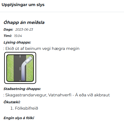
A good exemple of data product not clear enough is the traffic accident map.
- data sources?
We don’t know. However, a bit of know-how will tell you that the data comes from Samgöngustofa (The Icelandic Transport Authority). And by checking their provided accident map, you can cross reference the tourists accident. The following accident happend near Blönduós on the 23rd of June at 15:04, the car drove off the road to the right. No one got injured.
- Methodology? Who calculated, counted and gathered these accidents? Is it based on police record that samgöngustofa collected? Is it based on insurrance policy claims?
- Definitions? What is an “accident”? What is a tourist? What is serious injury? damages to the car or injuries to people?
Answering the questions above allows the dashboard to generate a story that will convey a message or story that answers an interogation of stakholders.
Presentation Issues
The current implementation faces several technical challenges:
- Iframe integration problems that affect usability
- Download functionality limitations
- Overlapping menu elements
- Poor mobile responsiveness
These issues significantly impact the dashboard’s utility and accessibility.
FAIR Principles Analysis
The dashboard falls short when evaluated against the FAIR principles:
Findability
- Metadata are insufficient
- Machine-readable formats are not readily available
- Data discovery mechanisms are limited
Accessibility
- Data access methods are not well-documented
- Download options are restricted
Interoperability
- Limited ability to integrate with other datasets
- Poor compatibility with common analysis tools
Reusability
- Insufficient documentation for data replication
- Limited metadata for context
- Unclear terms of use and licensing
Business Intelligence Perspective
The dashboard is straddling multiple purposes without clearly excelling at any, limiting its effectiveness as a business intelligence tool. Several critical questions need addressing:
- Is it meant to be a static historical presentation or a dynamic analysis tool?
- Should it prioritise real-time monitoring or information sharing?
- Does it serve operational or strategic needs?
Business Intelligence is about transforming raw data into actionable insights that drive value creation. In tourism, this means going beyond simple visitor counts to understand patterns, predict trends, and support strategic decision-making. A true BI solution should enable stakeholders to answer complex questions like “How do weather patterns affect visitor behaviour?” or “What is the impact of flight capacity on regional tourism distribution?”
The current implementation falls short of these BI principles. It presents data without facilitating deeper analysis, lacks integration across different tourism-related datasets, and offers limited tools for pattern identification. Without the ability to cross-reference different data points or perform trend analysis, the dashboard struggles to generate the insights needed for strategic tourism management.
The key answer is not technical, it is to answer why does this dashboard exists.
A few recommendations for Improvement
1. Technical Enhancements
- Implement proper responsive design
- Improve download capabilities
- Fix iframe integration issues
- Enhance menu functionality
2. Data Quality and Documentation
- Clearly document data sources and methodologies
- Provide detailed definitions of key terms
- Include metadata for all datasets
- Implement version control and data update logs
3. User Experience
- Design separate views for different user groups
- Improve data exploration capabilities
- Include context and interpretation guidance
4. Integration Capabilities
- Provide API access
- Enable data export in raw formats
- Create integration guides for common tools
Resource Considerations
Implementing these improvements requires:
- Dedicated technical team for maintenance
- Regular stakeholder engagement
- Ongoing data quality management
- User support and documentation
- Regular review and updates
Conclusion
While the current tourism dashboard represents a step towards data-driven tourism management in Iceland, it requires significant improvements to serve its purpose effectively. The focus should be on creating a tool that not only presents data but enables understanding and decision-making.
By addressing these issues, the dashboard could become a valuable resource for tourism management in Iceland, providing actionable insights for various stakeholders while maintaining data integrity and accessibility.
Áfram með smjöið !
Author’s Note: This critique is based on current observations and industry best practices in dashboard design and implementation. The goal is to contribute to the improvement of this important tool for Iceland’s tourism sector.